
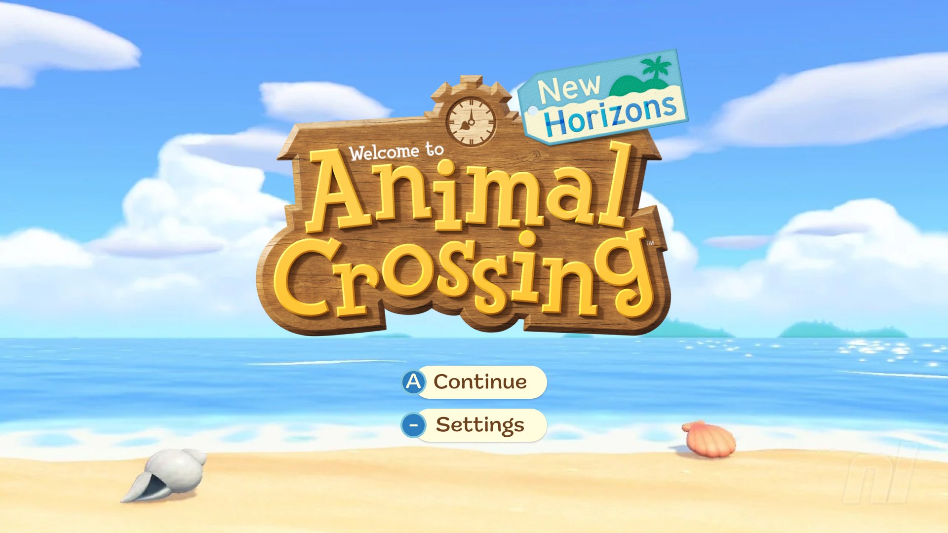
Animal Crossing: Gaming UI/UX Case Study
UX/UI DESIGN / USER TESTING
Overview:
A design study of Nintendo Switch’s Animal Crossing New Horizons’ UX/UI. This project was completed as a part of ELVTR’s UX/UI in Gaming introductory course over 7 weeks.
Tools: Figma, Illustrator, Photoshop
Challenges
Design a restrained UX experience and unobtrusive UI
Design for a diverse audience
User testing gaming wireframes using static images
A short time span, juggling a full-time job
Learn Figma
UX Design
Player Journey
Paper Prototype and Flow Chart
Wireframes and Iterations


User Testing Results Notes:
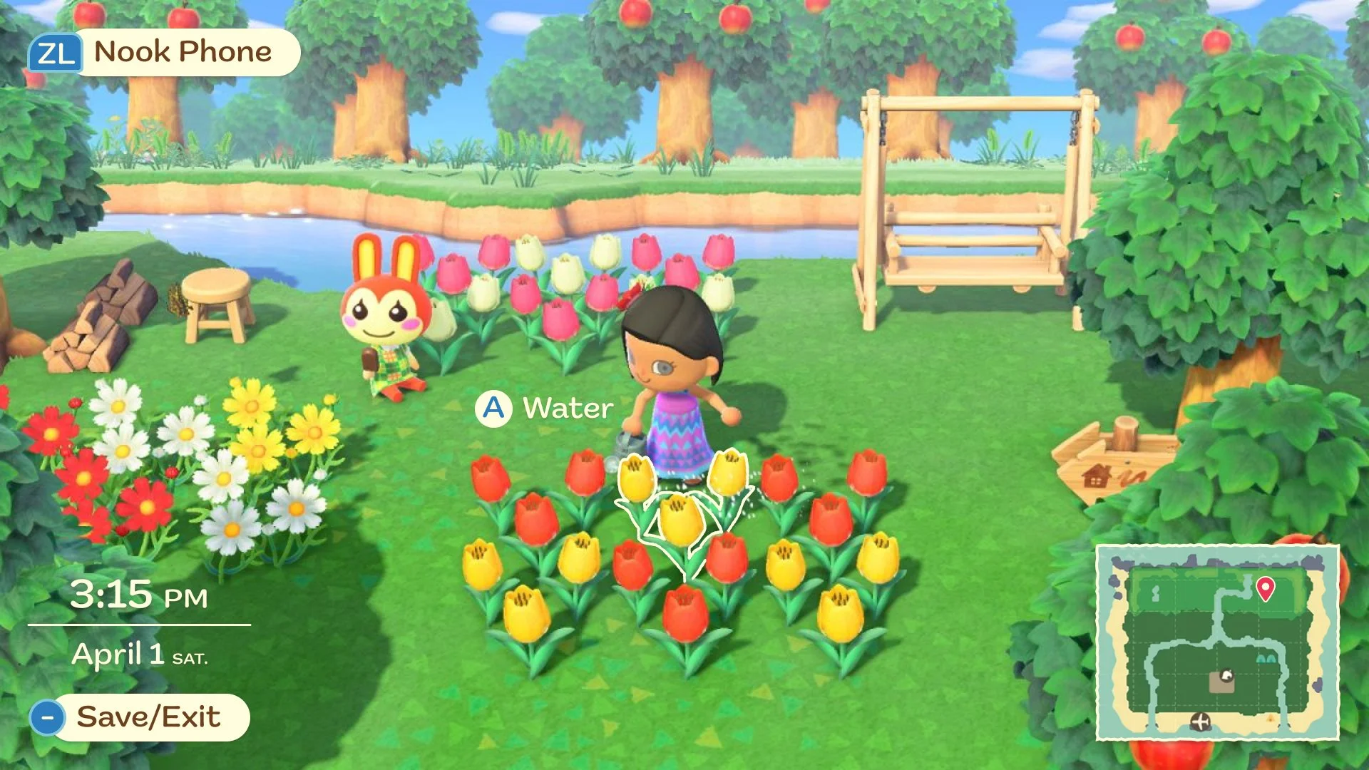
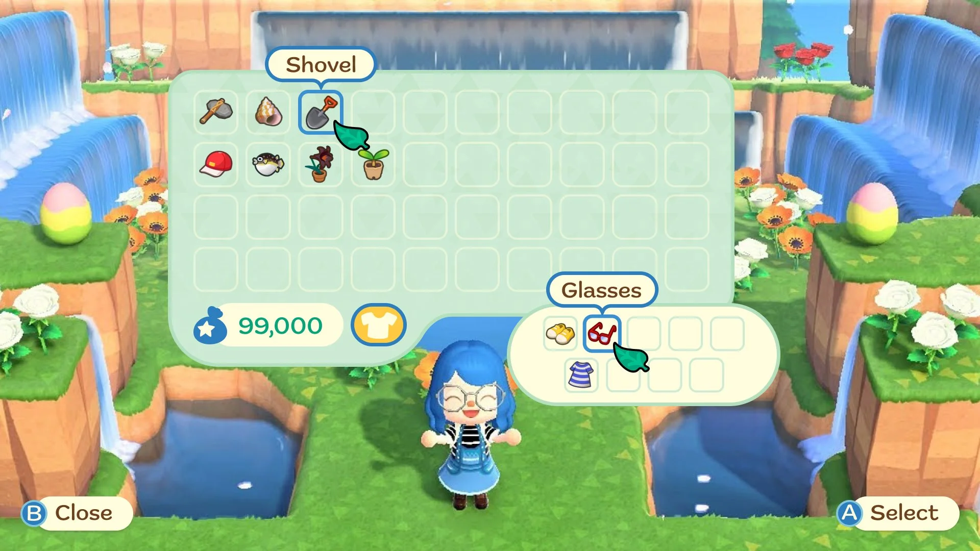
Most testers were satisfied with the lack of in-game direction since the Nintendo Switch controller has limited buttons. However, there were a few things to improve: character’s (gear) inventory, what they are able to interact with, and how to save/exit the game. Testers couldn’t tell that the Clothing inventory was what their character was currently wearing - was it a separate clothing bag?
Iterated Wireframe:
When updating the design, it was important to maintain an immersive experience and consider the portable nature of the Switch (small screen). This is a creative sandbox game: the screen should not be bogged down by UI unnecessarily. The solution: When user idles, UI will appear to encourage engagement… ie. interact with object and how to exit the game. All menu buttons also have the Switch controller command. The character’s gear has become a separate menu still tied to inventory.

UI Design
Style Guide
Type styles represent the logo design and a storybook feel. Strong serifs are reserved for major headlines, and a cute, legible rounded font is for everything else in between.
The color green is huge in this game, but there are also seasons that change the game’s look. Considering this, the green has a bluish tint to account for the Winter season. The rest of the palette is made to compliment the primary color, nature, and seasonality of the game.

Mockups
Accessibility Testing
Each design was tested through the color blindness simulator for players with monochromacy and blue/green/red deficiencies.
The designs mostly succeeded against the tests - the middle blue in the palette was darkened.


Outcomes
Obtained an education and understanding of the UX/UI gaming design process.
Gained a new appreciation for this game and why certain decisions were made.
Learned how to work within a short time limit with very limited knowledge in an introductory course.
I am looking forward to the next project and next game study!
Student, UX/UI Game Design
ELVTR UX/UI for Gaming
Instructor: Ivy Sang
User Research, Player Journey, Flowchart, Wireframe, User Testing, Design Mockup, Accessibility Testing